Getting deep & meaningful with Inspiritus Press
Getting deep & meaningful with Inspiritus Press
Case study
Case study
My Role:
Branding, Creative Direction, Marketing, Content, Print, Publication and Distribution
My Role:
Branding, Creative Direction, Marketing, Content, Print, Publication and Distribution

I was responsible for creative direction for the publishing start up, and early on, we established the brand wanted to achieve several things:
Enigmatic and abstract – effectively represent its abstract interests in things like metaphysics and spiritually challenging content, enticing its audience to take time to dive deeper.
Formal and adoptive – after competitor research, most local small presses position themselves as casual and modest, while Inspiritus suggests it is a larger movement of thought and ideology, freely adopted by more people. #startaculthashtag
Modern and iconic – the press is run by a young team resisting status quo, experimenting with and not-specified in form, and included within a large range of endeavours, for example, would be merchandise, fashion, and accessories with the brand – the next Apple product, maybe.
The logomark alone is an important part of a brand. The Inspiritus swish is often used on book spines and product packaging and represents the organization by association. Visually, it generates a dynamic movement.
The logomark alone is an important part of a brand. The Inspiritus swish is often used on book spines and product packaging and represents the organization by association. Visually, it generates a dynamic movement.

But there’s more to the story. The Latin word, Inspiritus, means “breathe” and contains the word for “spirit”: in other words, to breathe in and be filled with the spirit. It is also the root for the word inspiration. The mark represents a breath of air, a gust of wind, the winds of change, and a spirit, or a force, that carves its way forward.
But there’s more to the story. The Latin word, Inspiritus, means “breathe” and contains the word for “spirit”: in other words, to breathe in and be filled with the spirit. It is also the root for the word inspiration. The mark represents a breath of air, a gust of wind, the winds of change, and a spirit, or a force, that carves its way forward.
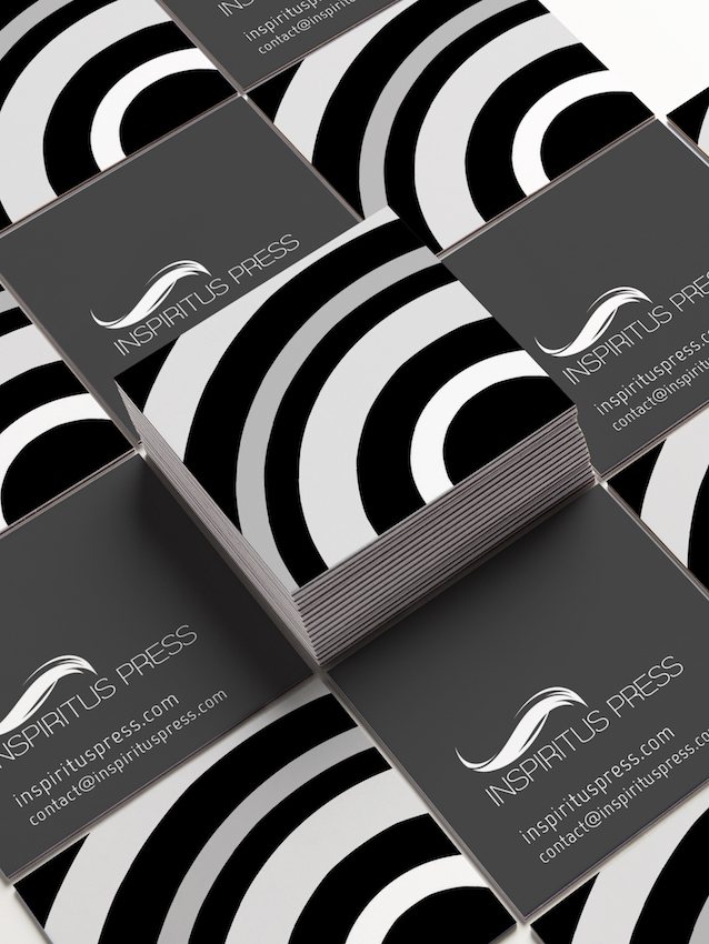
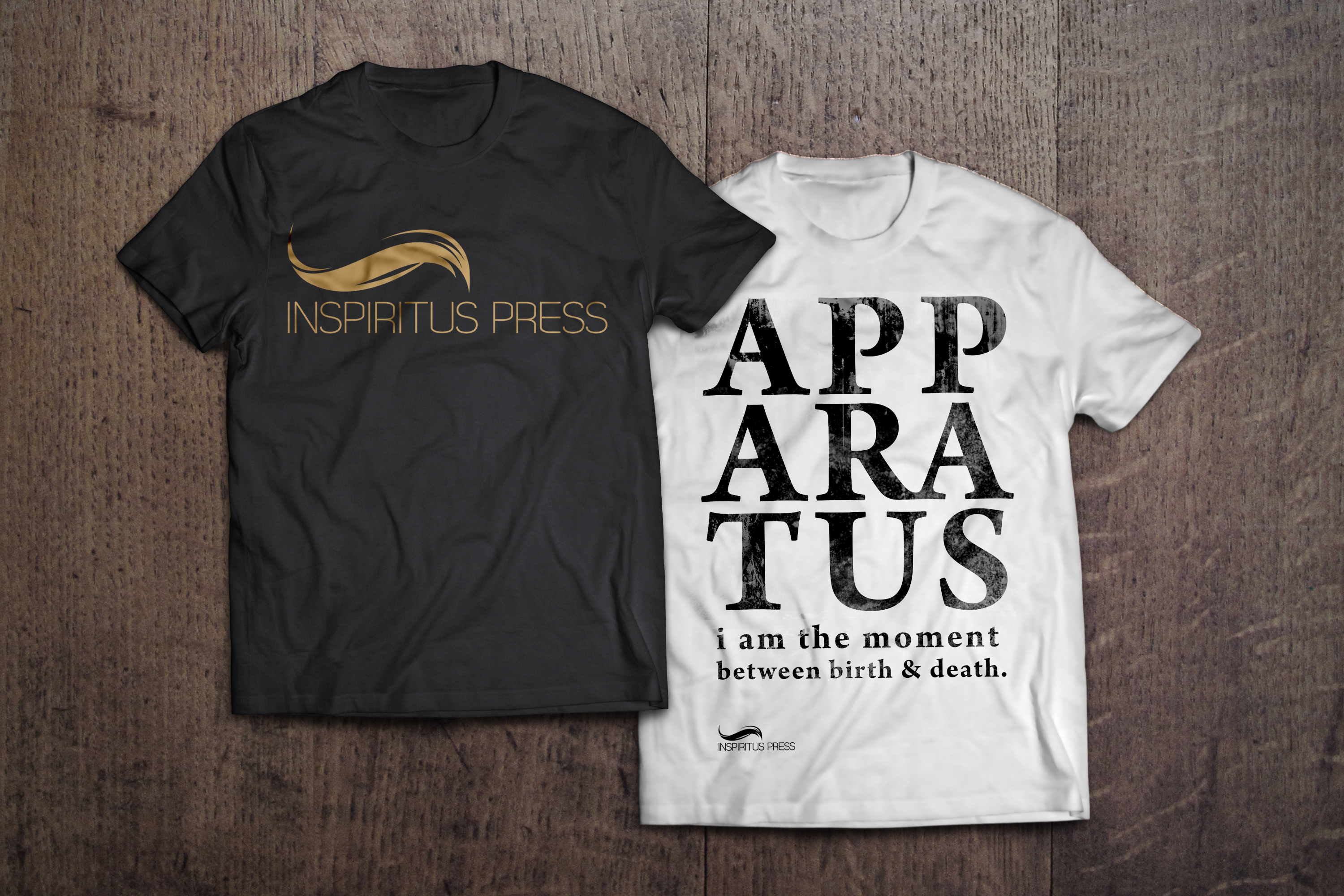
We decided to use a primarily minimalist black and white scheme not only for its iconic sleek enigma and its stark contrast from many colourful book covers of competitors, but as it represents the empty blank canvas for endless possibilities in artistic collaboration and experimentation across disciplines and mediums.
We decided to use a primarily minimalist black and white scheme not only for its iconic sleek enigma and its stark contrast from many colourful book covers of competitors, but as it represents the empty blank canvas for endless possibilities in artistic collaboration and experimentation across disciplines and mediums.
Apparatus
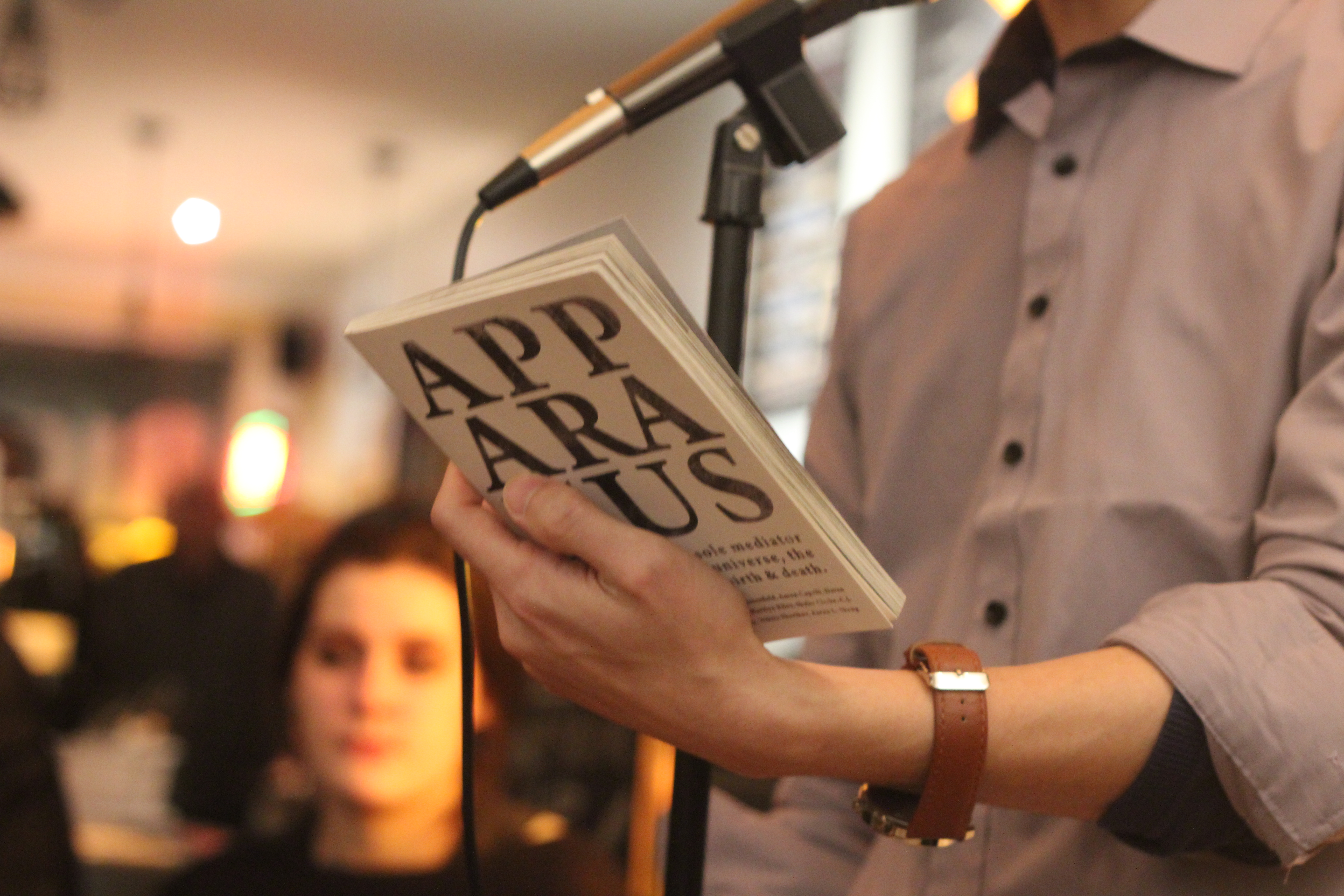
Inspiritus Press' debut book was launched in February 2017 with astounding success. I was involved with the entire production. The project was initiated by one of the editors at the press, establishing a theme revolving around the human body as a fallible apparatus and interface between our spirit and the world beyond. The editors of Inspiritus Press recruited 15 contributors, young emerging writers, putting together the collection of surreal and grotesque poetry and short prose.
Apparatus
My Role:
Publication Design, Print and Distribution, Content Editing
Inspiritus Press' debut book was launched in February 2017 with astounding success. I was involved with the entire production. The project was initiated by one of the editors at the press, establishing a theme revolving around the human body as a fallible apparatus and interface between our spirit and the world beyond. The editors of Inspiritus Press recruited 15 contributors, young emerging writers, putting together the collection of surreal and grotesque poetry and short prose.
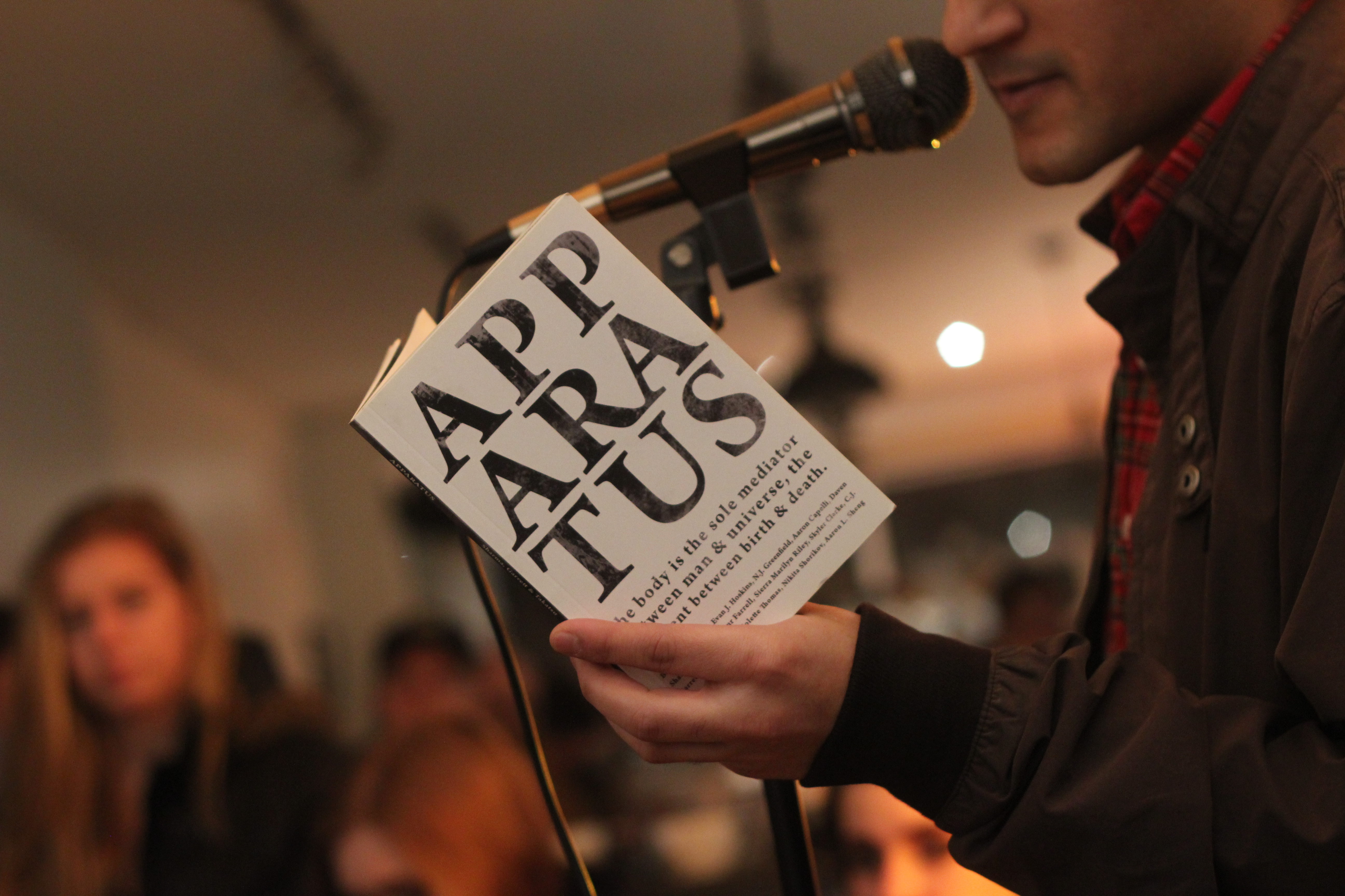
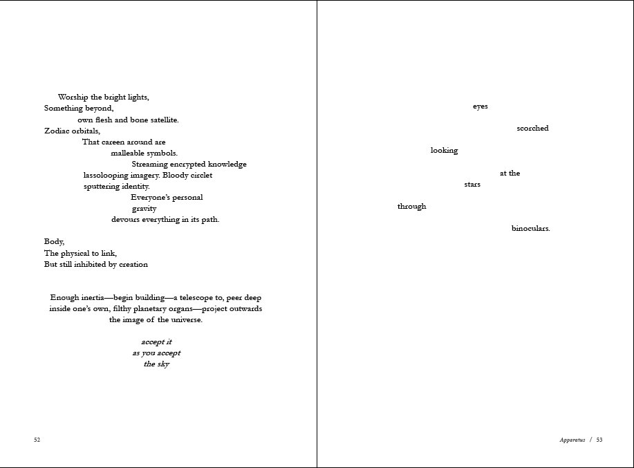
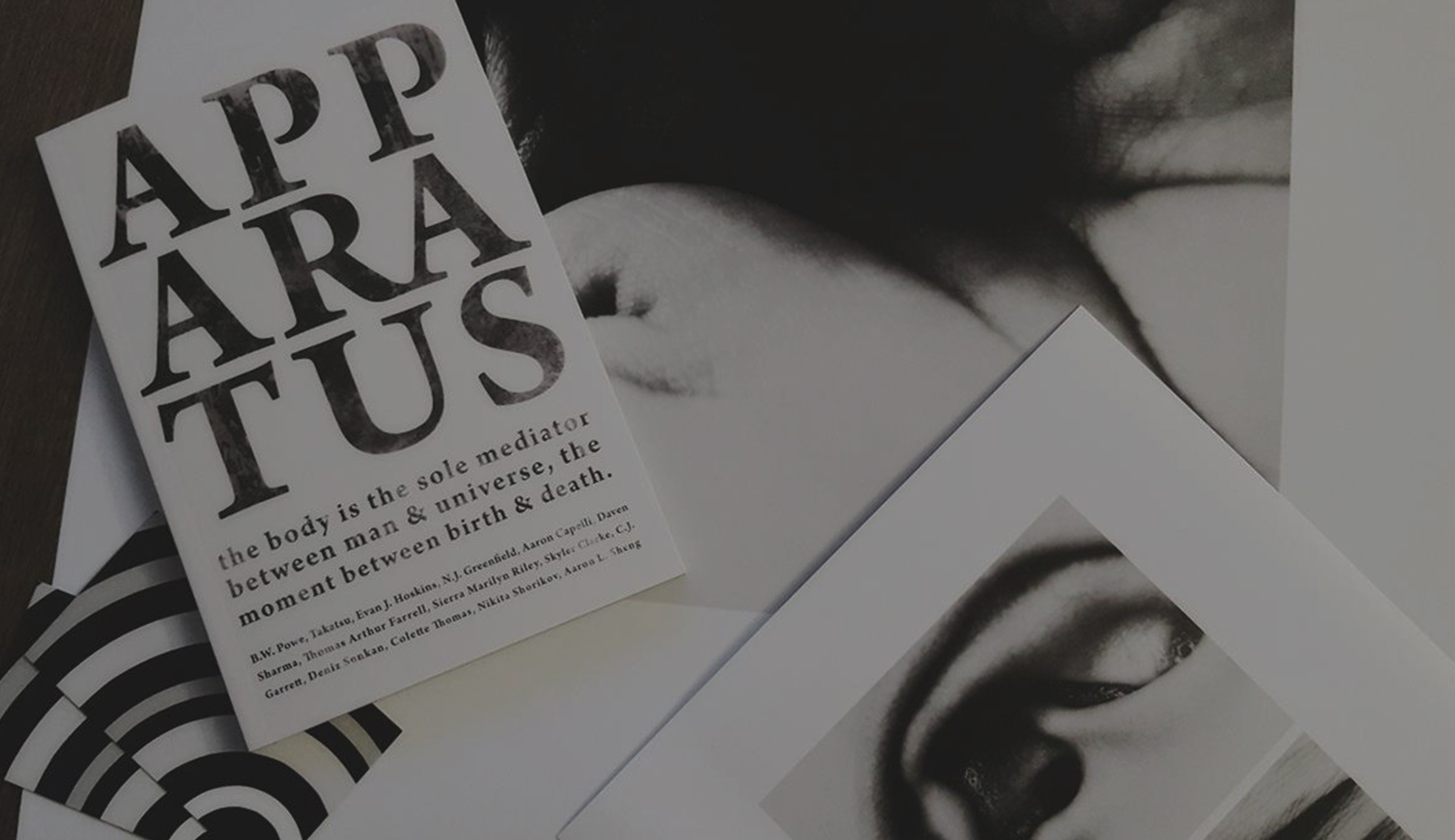
While I had a hand the editorial process, my role was creative direction and ultimately, a proud advocate of the finished product. When I heard about the theme, I already visualized a concept similar to sight tests at the optometrist's. The eye or sight, is a representation of this physical gateway between world and spirit. Large fonts, open arrangements, and cropped text breaking out of words or sentences were also a graphic design trend during 2017.
While I had a hand the editorial process, my role was creative direction and ultimately, a proud advocate of the finished product. When I heard about the theme, I already visualized a concept similar to sight tests at the optometrist's. The eye or sight, is a representation of this physical gateway between world and spirit. Large fonts, open arrangements, and cropped text breaking out of words or sentences were also a graphic design trend during 2017.
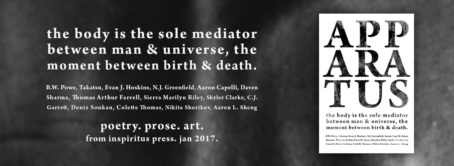
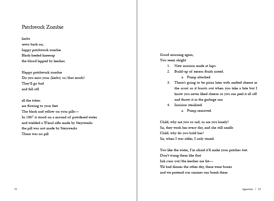
We had come to an agreement that the book wanted to achieve a mechanical Frankenstein impression, and suitably, the main typography used was Arno Pro along with grunge effects, for its thick formal serif, clean edges, and grotesque medical feel. This font is also used in marketing material and video production on black backgrounds, reflecting old French surrealist films in the 1920s. Interior page fonts were the thin, minimalist, and very elegant, Cormorant - one of my favourites. Considering competitor research, most industry standard trade books make use of Garamond style fonts (which is known to have the highest statistics for text comprehension) and I didn't want to move too far from this in order to appeal to readers. However, Comorant still stands apart as a better and more unique choice. For a book and its readers, good typography is always important.
We had come to an agreement that the book wanted to achieve a mechanical Frankenstein impression, and suitably, the main typography used was Arno Pro along with grunge effects, for its thick formal serif, clean edges, and grotesque medical feel. This font is also used in marketing material and video production on black backgrounds, reflecting old French surrealist films in the 1920s. Interior page fonts were the thin, minimalist, and very elegant, Cormorant - one of my favourites. Considering competitor research, most industry standard trade books make use of Garamond style fonts (which is known to have the highest statistics for text comprehension) and I didn't want to move too far from this in order to appeal to readers. However, Comorant still stands apart as a better and more unique choice. For a book and its readers, good typography is always important.
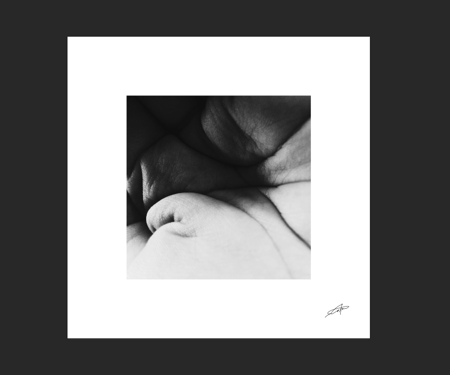
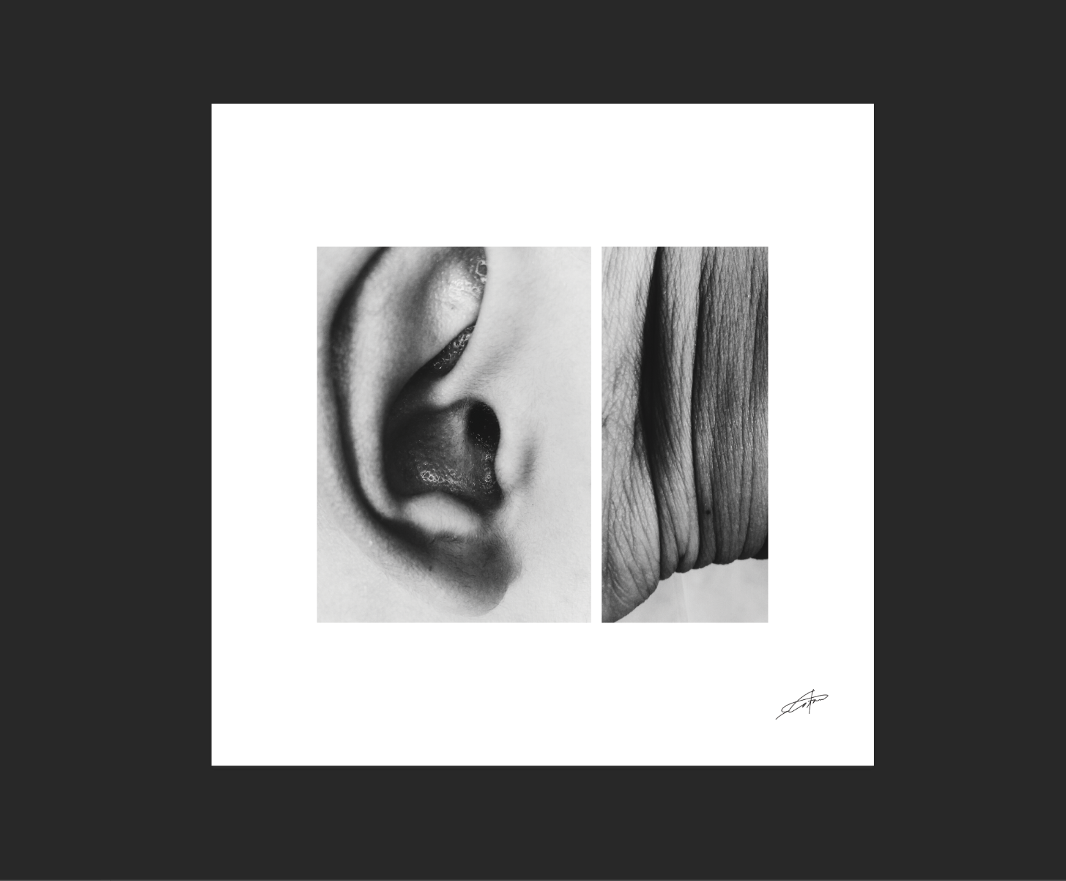
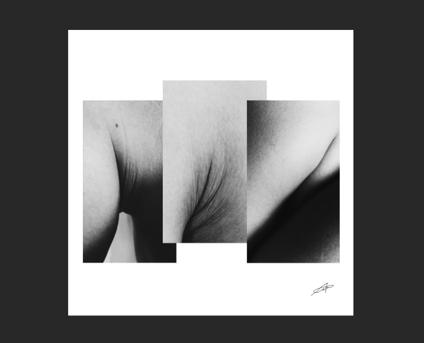
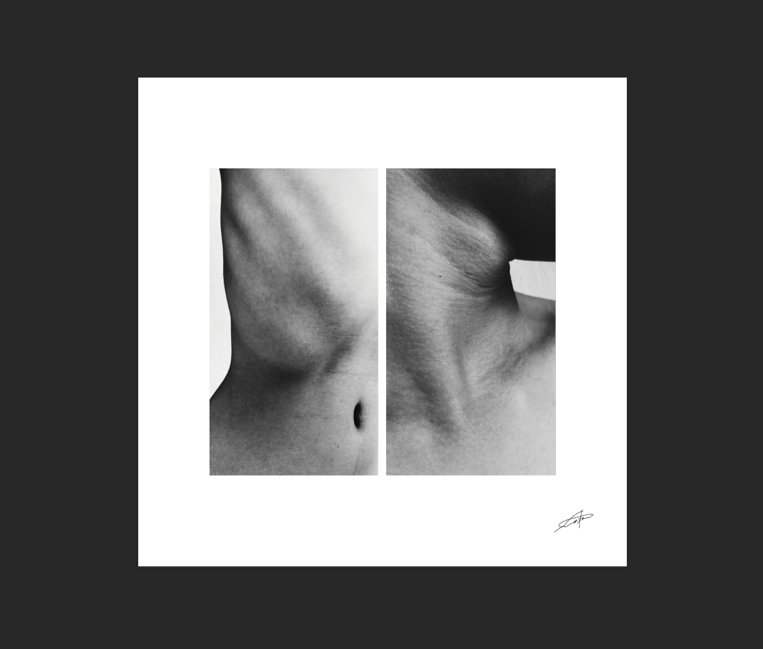
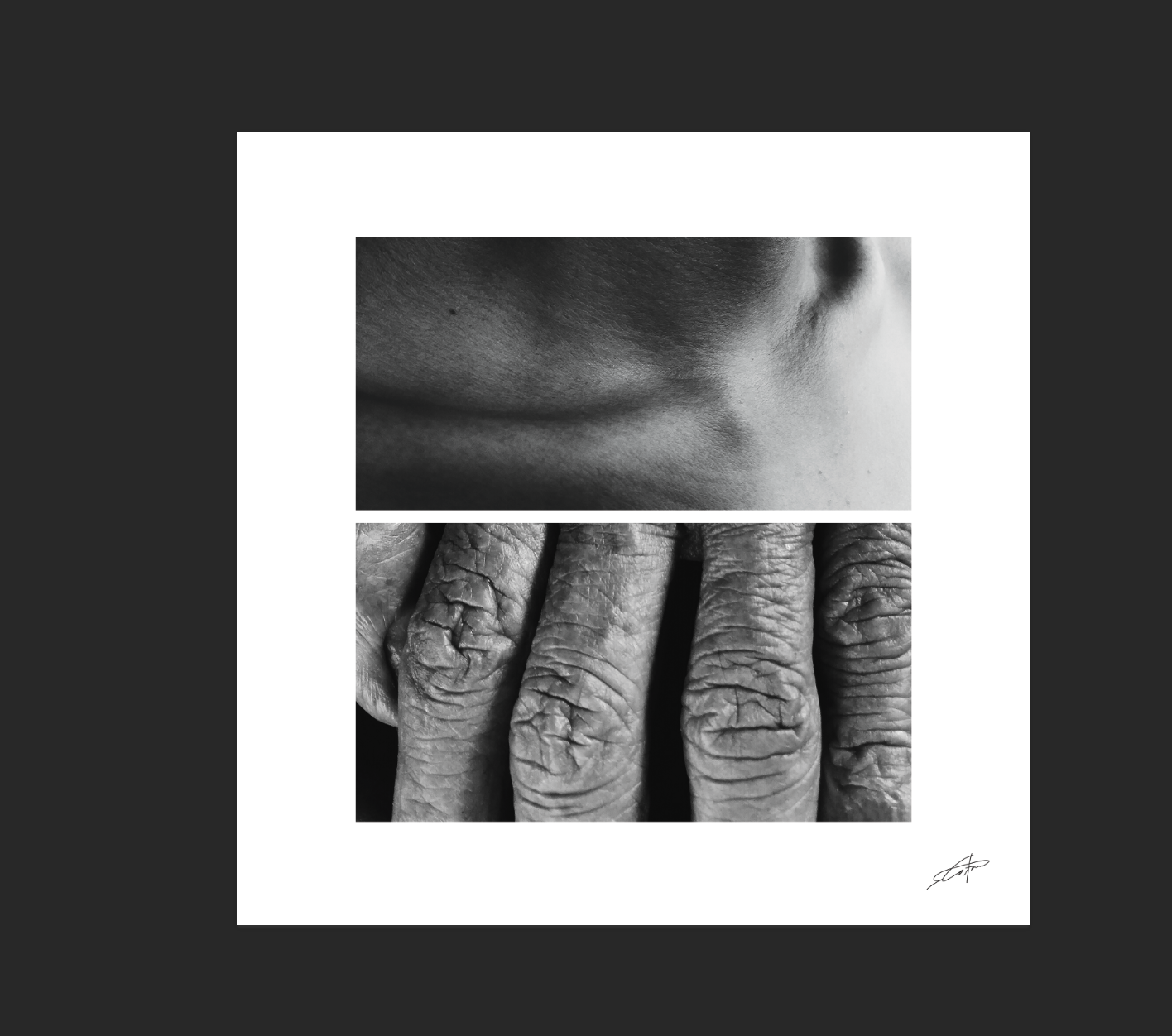
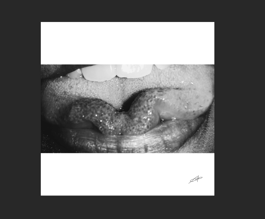
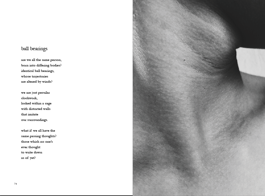
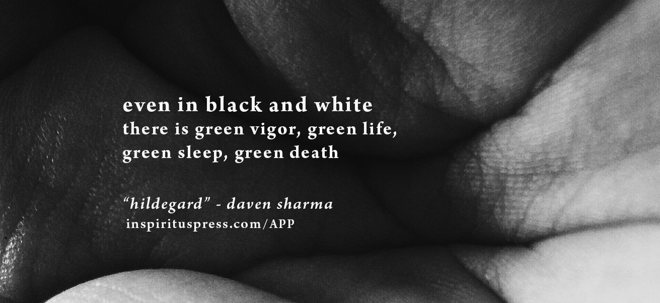
As Inspiritus Press is known as an interdisciplinary experimental collective, we needed to make sure the book included more than just words. I outsourced the project to an artist-photographer I am familiar with, providing detailed descriptions and examples of what we were looking for. The result was an incredible series of abstract close-up black and white photography of the human body, in never seen before ways, focusing especially on skin wrinkles, textures, folds, supplementing the editor's initial stylistic preference for the grotesque. I also asked for the photos to be taken with a phone camera, for a grittier, intimate, physical experience. It did not affect the quality of the photos presented. Aside from implementation in the book, I created gallery formatting for the photography series.
As Inspiritus Press is known as an interdisciplinary experimental collective, we needed to make sure the book included more than just words. I outsourced the project to an artist-photographer I am familiar with, providing detailed descriptions and examples of what we were looking for. The result was an incredible series of abstract close-up black and white photography of the human body, in never seen before ways, focusing especially on skin wrinkles, textures, folds, supplementing the editor's initial stylistic preference for the grotesque. I also asked for the photos to be taken with a phone camera, for a grittier, intimate, physical experience. It did not affect the quality of the photos presented. Aside from implementation in the book, I created gallery formatting for the photography series.
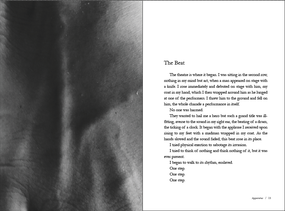
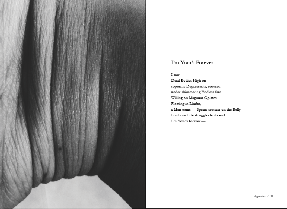
Using Adobe InDesign, first and foremost, I created a block in layout template, ensuring to measure word counts and page placement. Then I set style sheets, guides and formatting for the entire file. I made sure to pay attention to assymetry and the flow of the text, including use of white space. I also had the final call for proofreading and content curation for thematic flow and variation of format and page lengths, between poetry and prose. On the other hand, complementing the text, I chose conceptually relevant photographs. For example, for the short story "The Beat", the image of the veiny hand would reflect the pulse of the heart and the flow of blood. Throughout the entire book, I devised a thematic flow from pieces with a tactile, bodily quality to abstract, metaphysical experiences.
Using Adobe InDesign, first and foremost, I created a block in layout template, ensuring to measure word counts and page placement. Then I set style sheets, guides and formatting for the entire file. I made sure to pay attention to assymetry and the flow of the text, including use of white space. I also had the final call for proofreading and content curation for thematic flow and variation of format and page lengths, between poetry and prose. On the other hand, complementing the text, I chose conceptually relevant photographs. For example, for the short story "The Beat", the image of the veiny hand would reflect the pulse of the heart and the flow of blood. Throughout the entire book, I devised a thematic flow from pieces with a tactile, bodily quality to abstract, metaphysical experiences.
Whether in photography, typography, texture, and textual content, the book was unified in theme and style. Black and whites, clean minimalism and a flavouring of grunge and grit. It carried through to the print choices too. After consultation with a local large trade printer (who produced books for publishers like Scholastics, Palimpsest Press, University of Toronto, and more), we decided on grainy 5pt eco-friendly recycled natural cream stock, a matte laminate finish 12 pt cover stock, and perfect binding with PUR adhesive. Subsequent to the release of the book, many readers and publishing professionals complimented our paper choice - a professional bookstore feel, easy to flip, environmentally friendly, and down-to-earth.
*Event photography by Justin Lauzon (Lexical Canada/Word on the Street)
