


Branding
/
My Role:
Branding, Social Media, Print
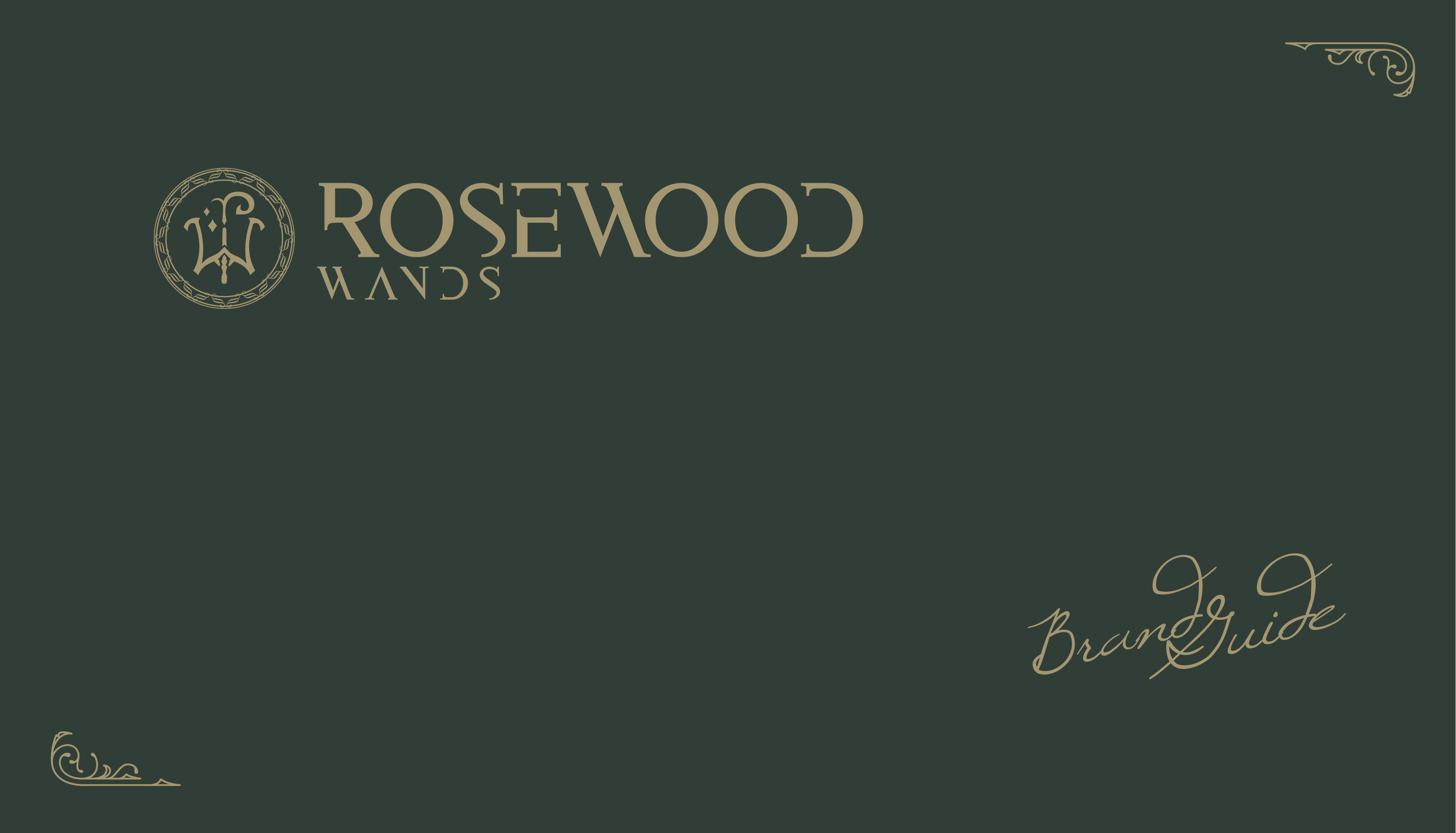
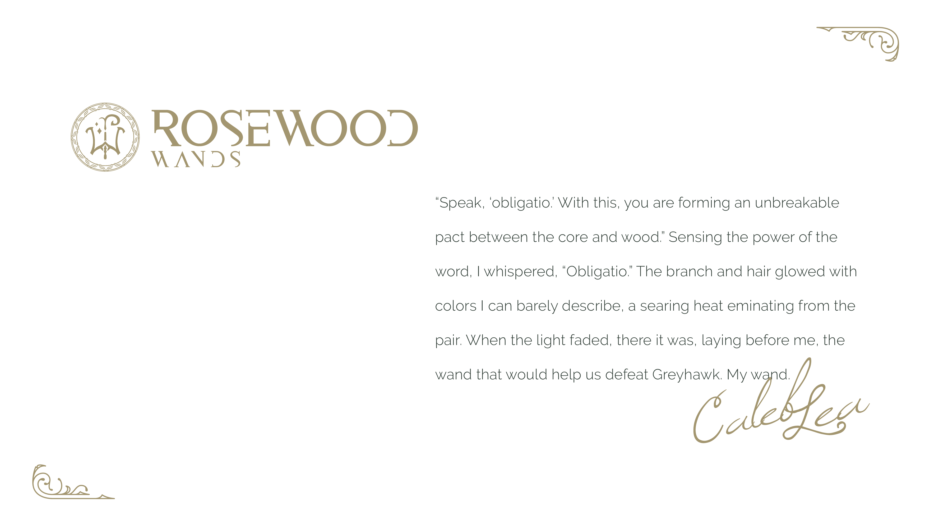
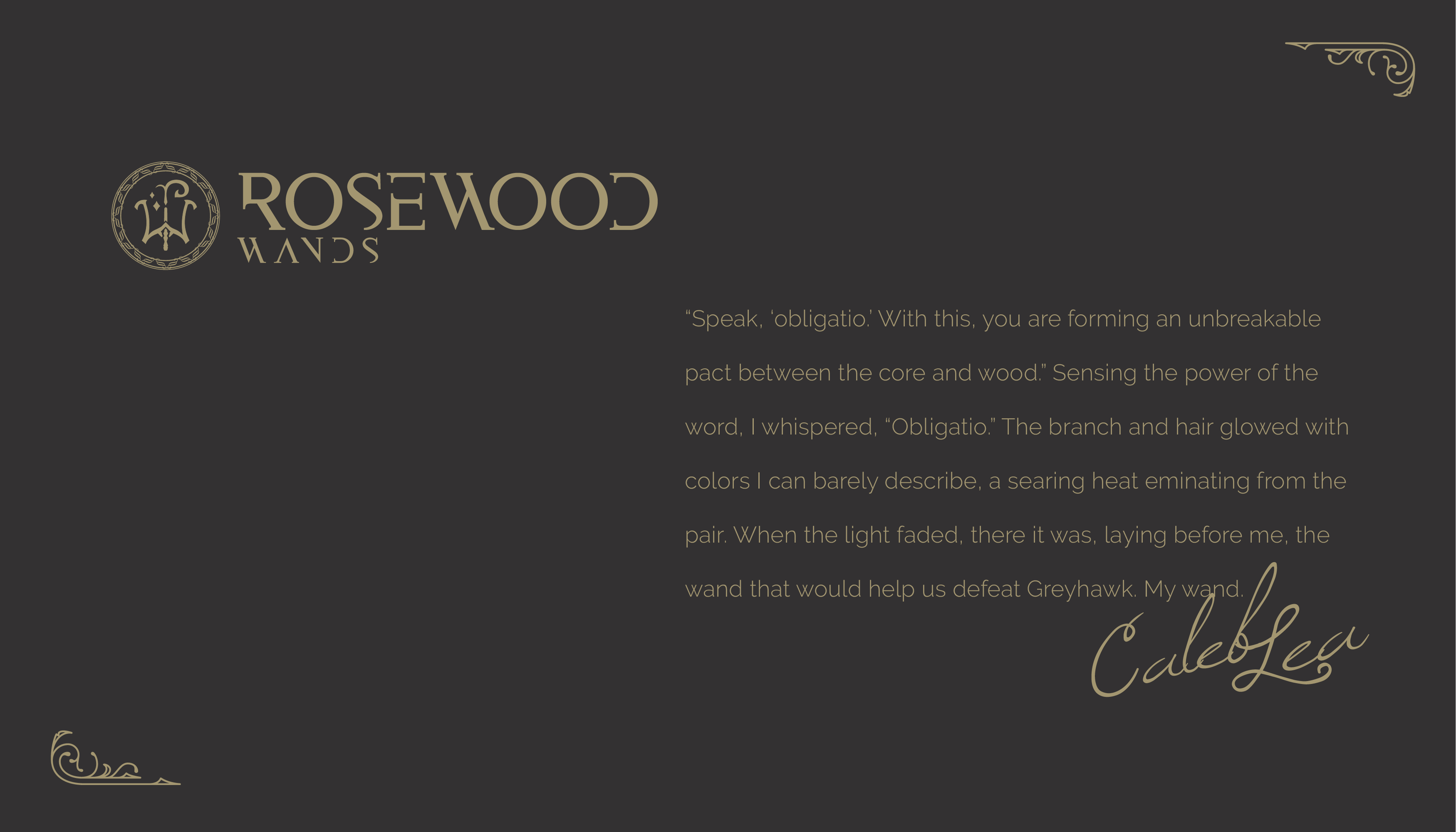
I was extremely excited to be able to do branding and identity design for Rosewood Wands. I had been friends with Caleb who creates the most beautiful and unique handcrafted high quality wooden wands for the Harry Potter, Wizarding World and fantasy fan community. As a fan of his work, this was my honour. Working with Caleb was a great collaborative experience and one where there were no boundaries. We went through many drafts and ideas before arriving at our final concepts.
Caleb often infuses his wand creations with symbolic meaning and writes intricately on wandmaking, origin stories, and the magical world, so the brand needed to convey deep lore, symbolism, character, and history. When first getting to know his preferences, he mentioned runes and that the original handdrawn logo has an important personal origin, so I wanted to pay homage to the R and W, and invoke a classic, high fantasy Tolkien vibe, that naturally has a bit of Celtic influence. The Druid and Elven spirit captures magic, nature, harmony & mystery. With some sort of synchronicity, Caleb happens to have a Celtic background.
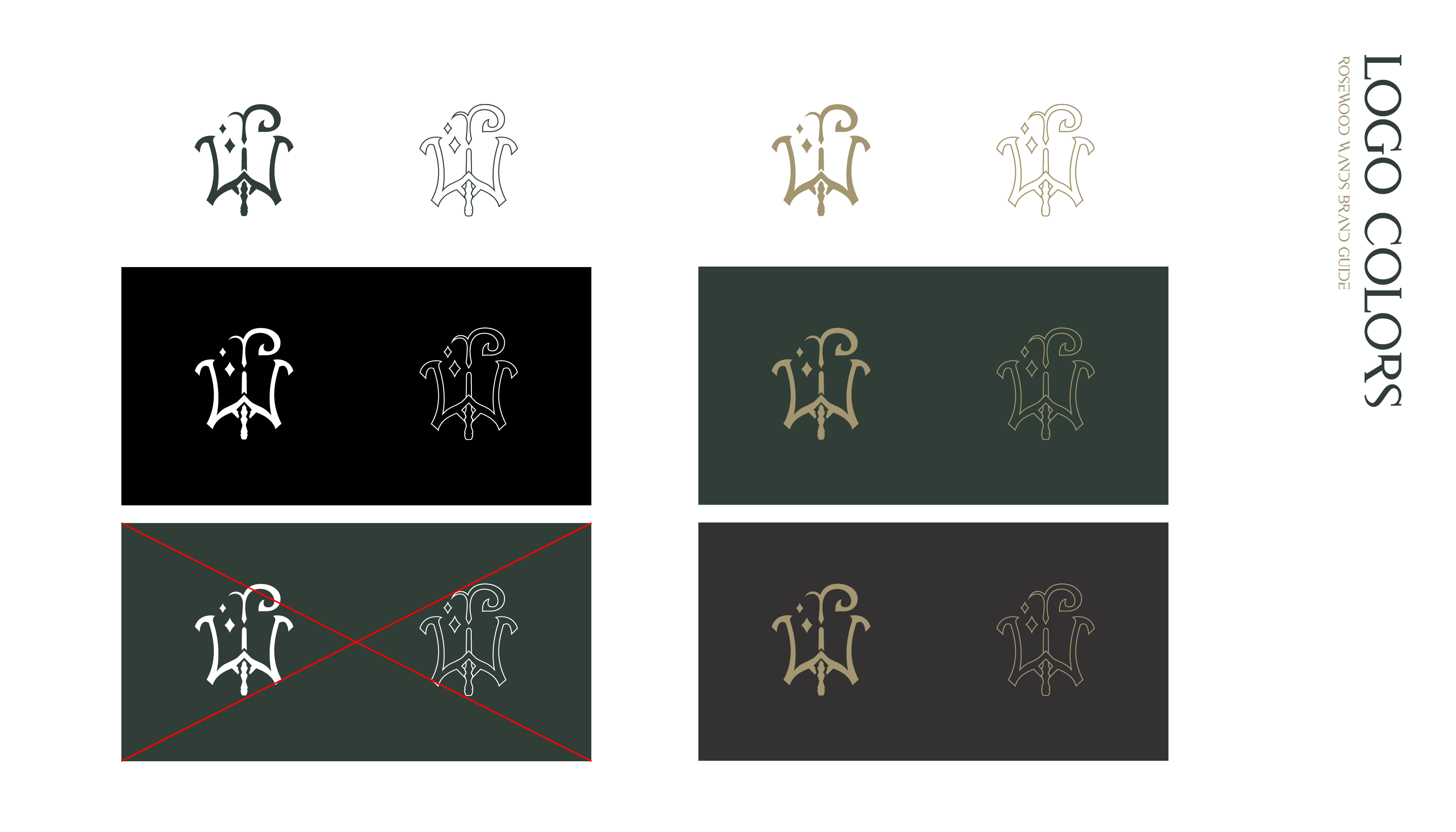
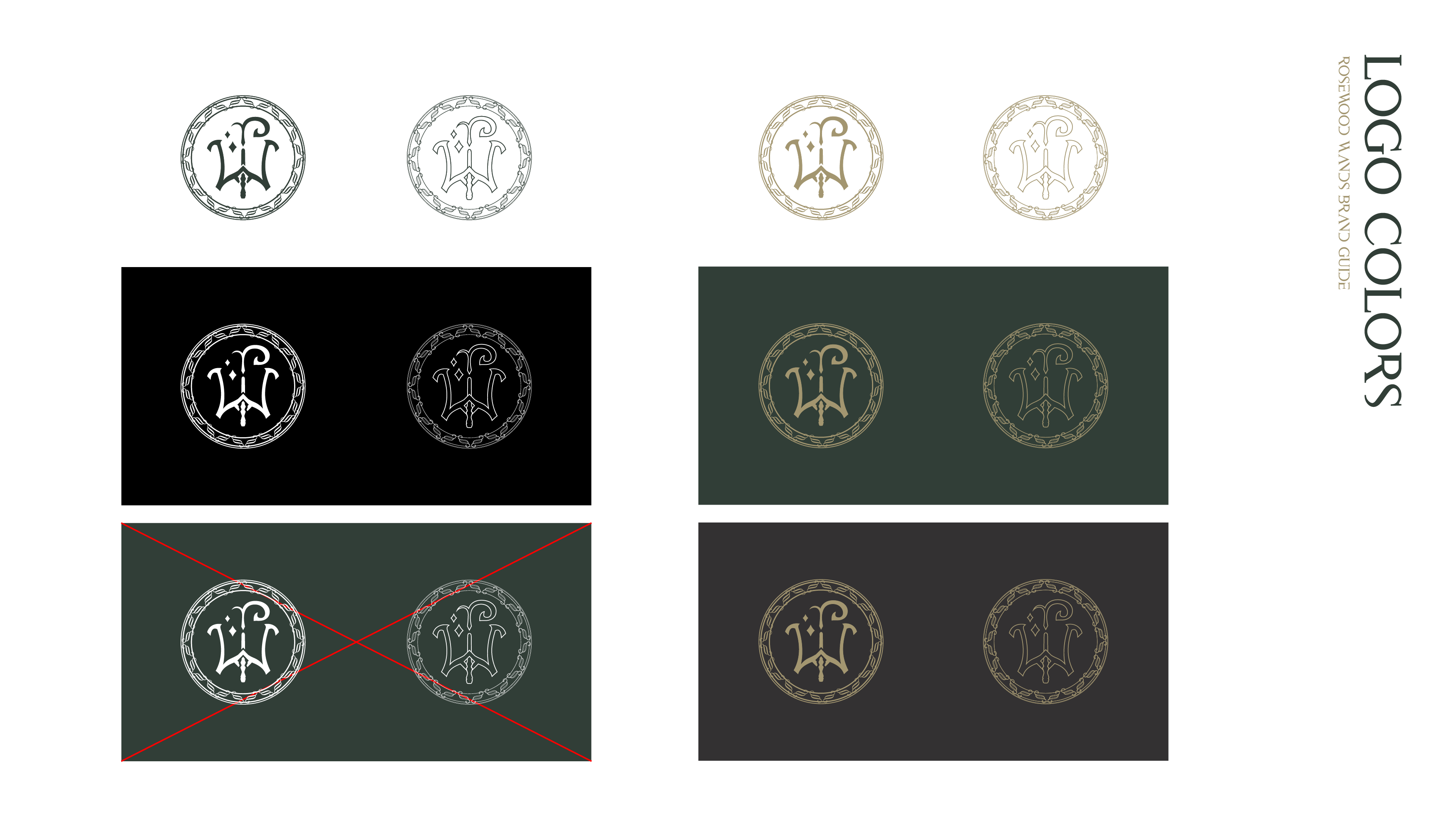
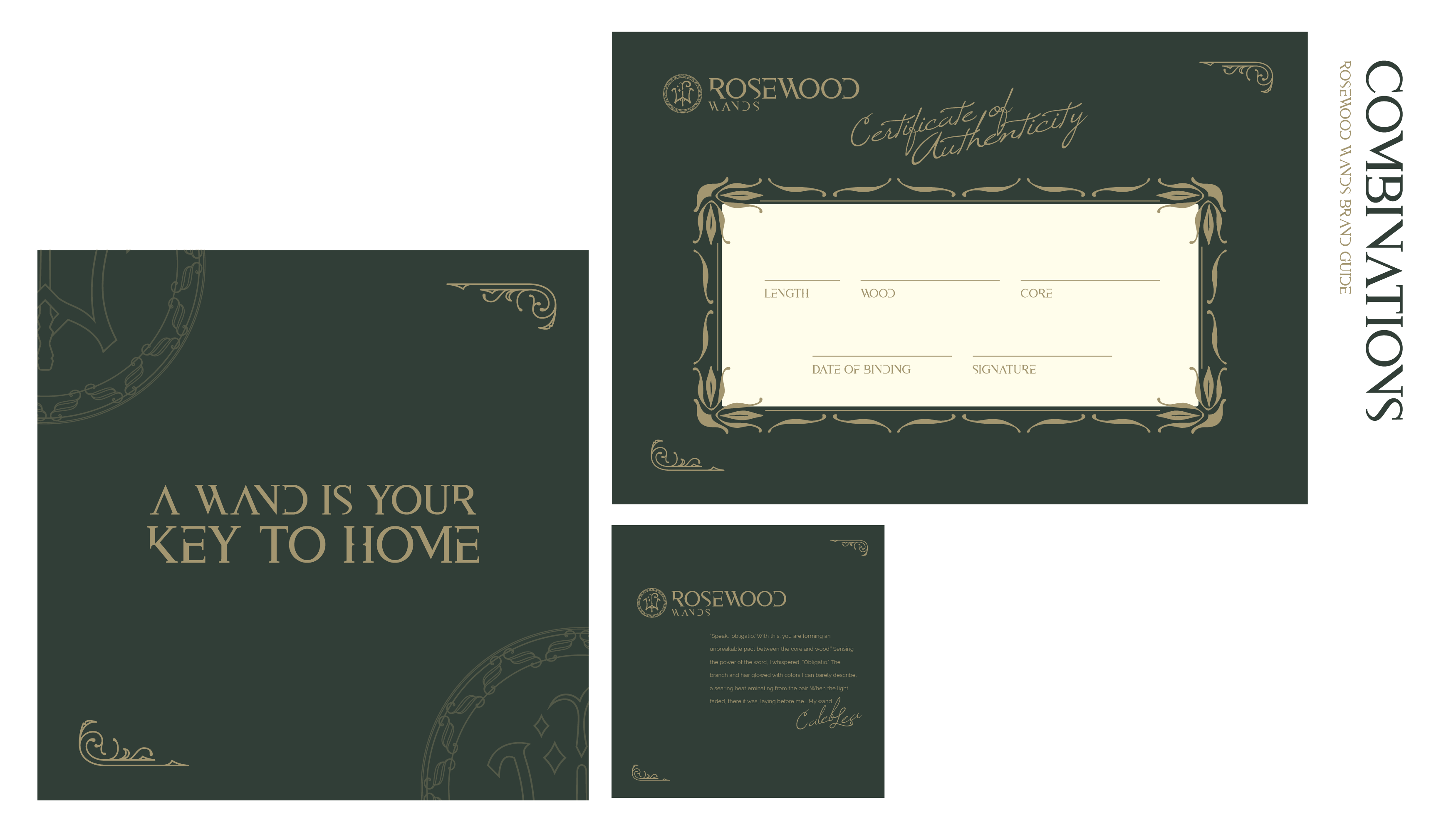
A logomark is not only iconic for a business, but in fantasy, should have history & be representative of a lineage, like a flag, a wax seal, a stamp, a crest. I drew some inspiration from gothic and blackletter aesthetic, but avoided making it too heavy. The Wizarding World requires a bit of whimsy, hence, there are two stars next to the "r” coming out of the wand for some flair.
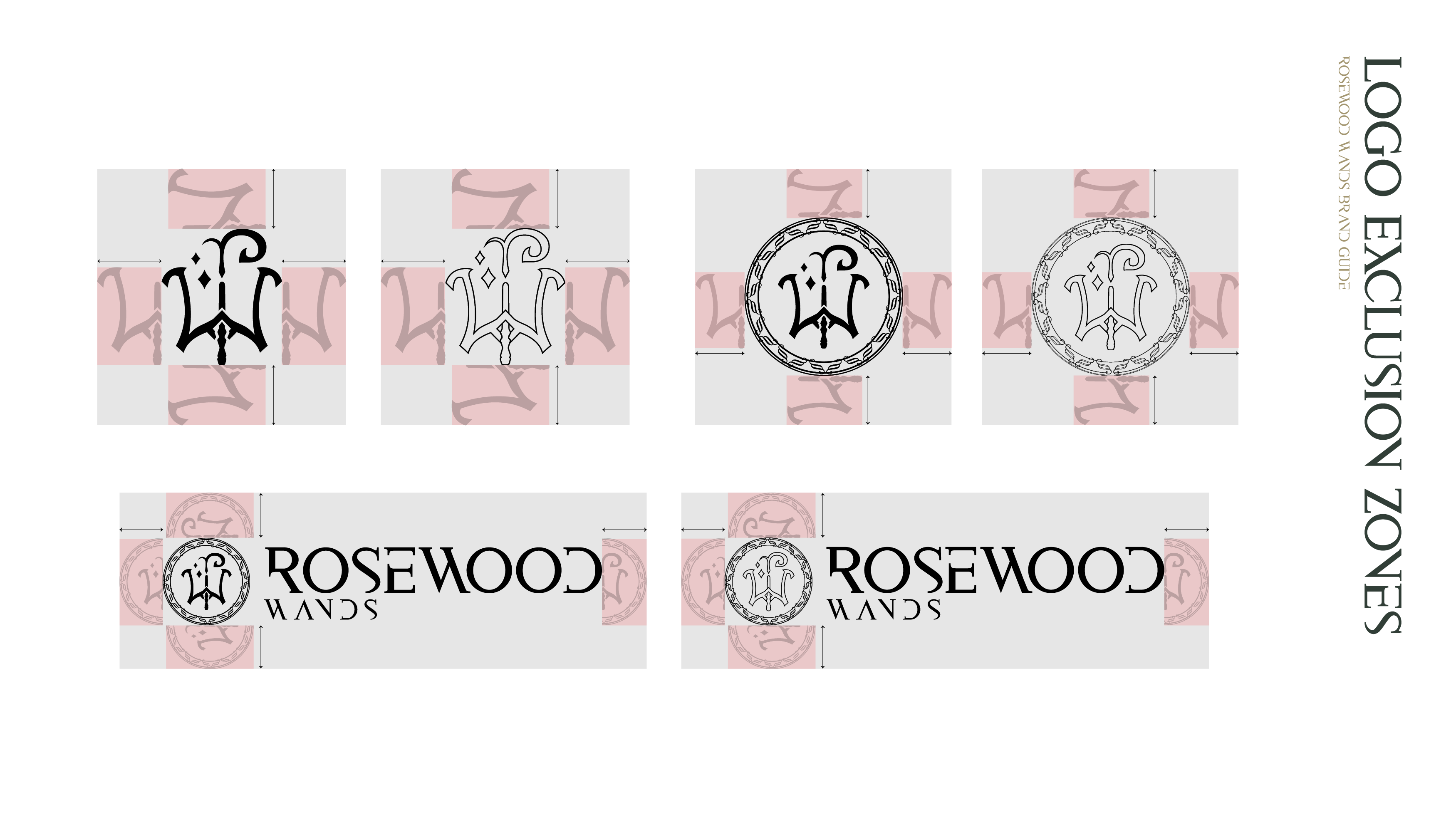
Logos must work at all sizes, even when scaled down for a profile picture. At the same time, when scaling up, the solidity of the mark becomes too heavy for the eyes, so an outlined version works for larger scale or as background.
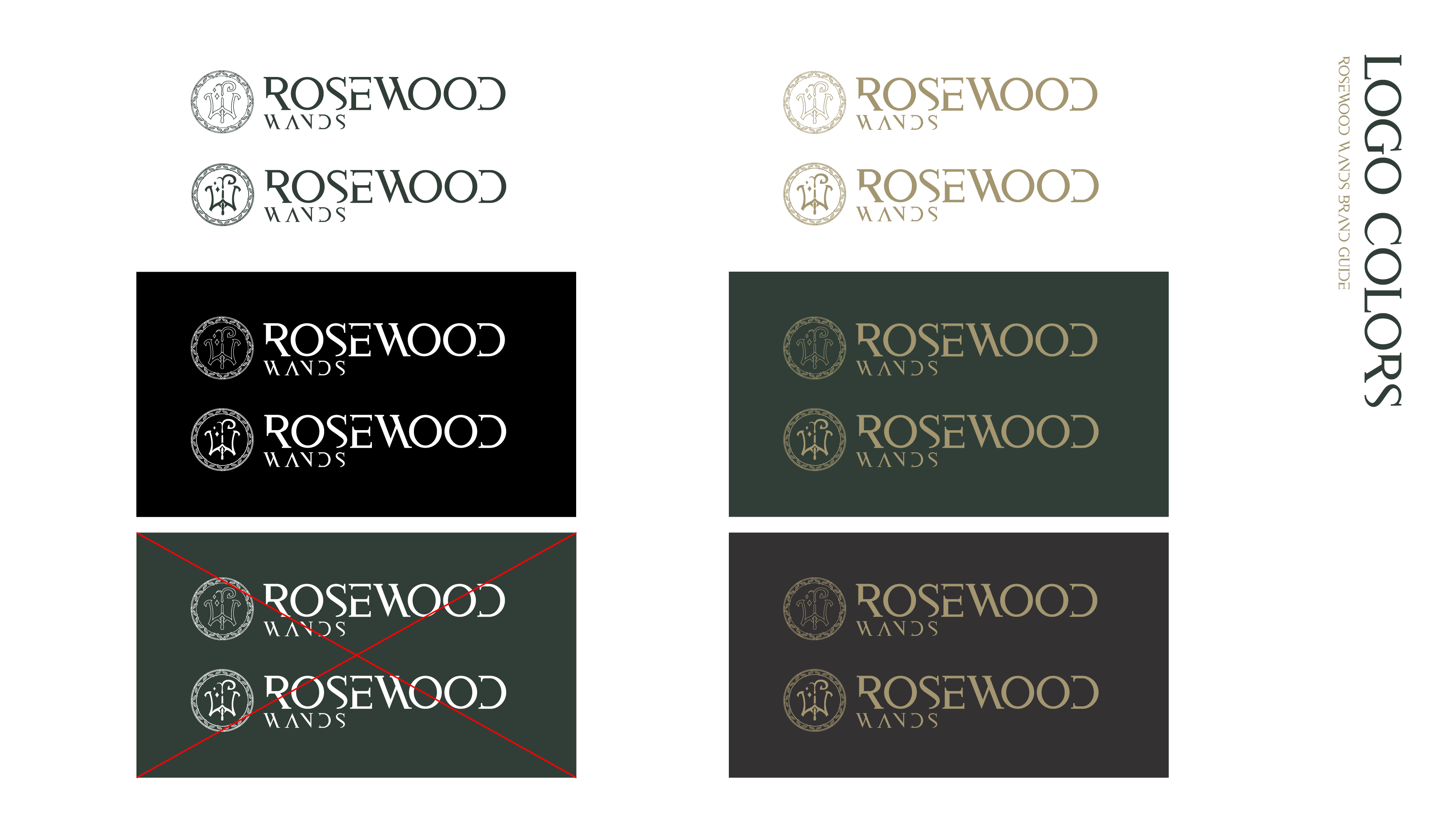
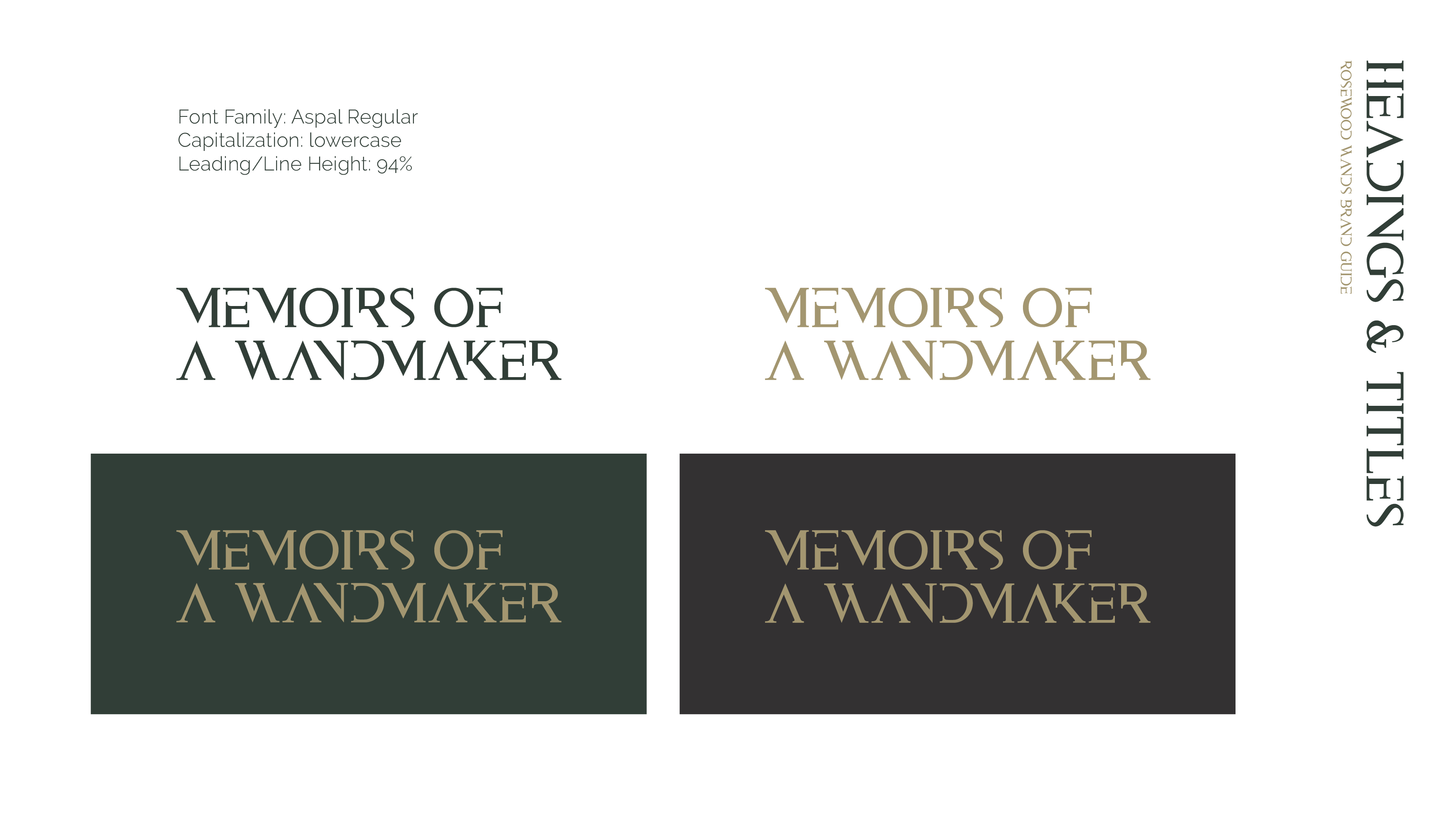
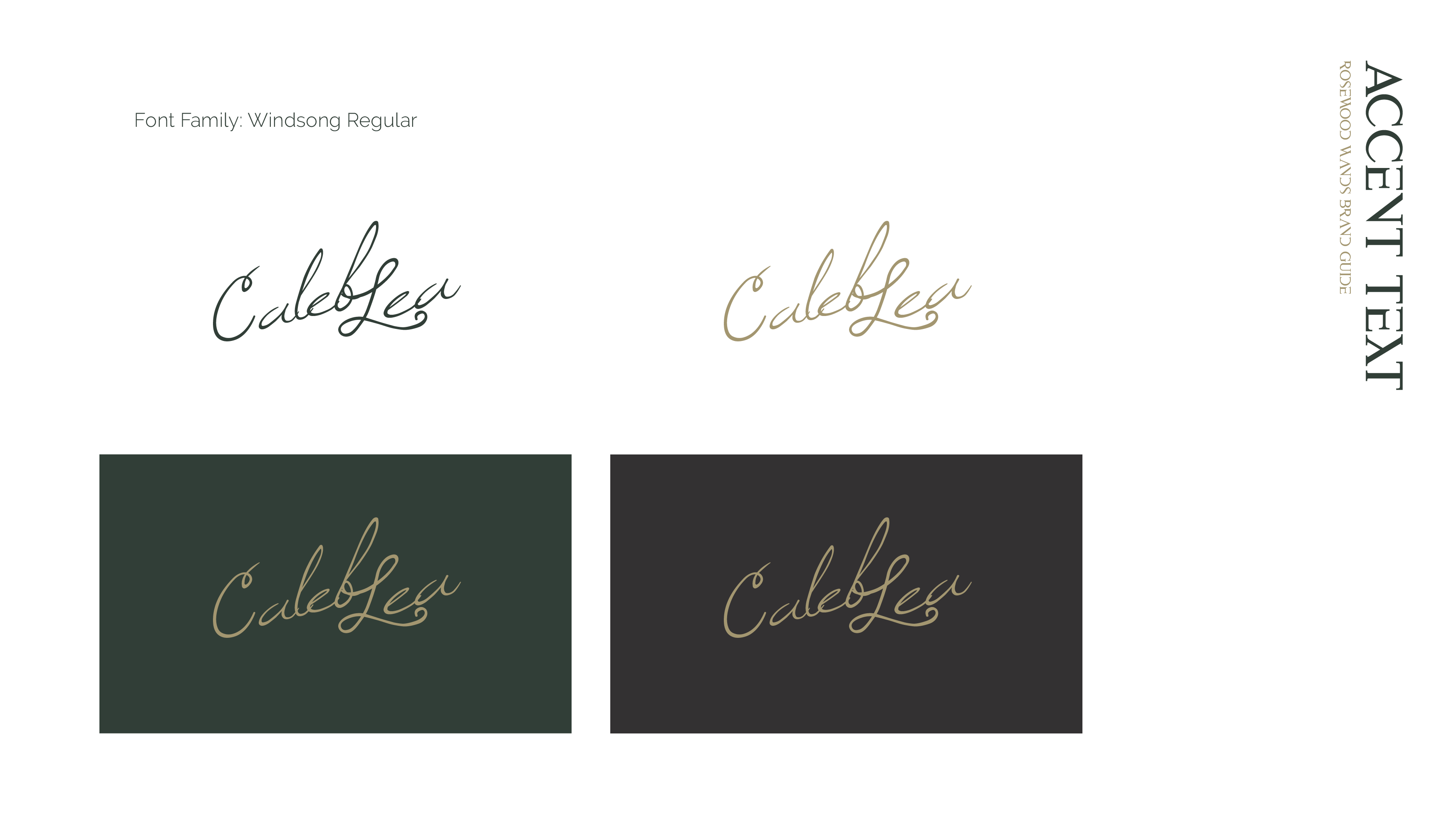
Of course, as a business, it needs to be practical, and I introduced modern clean corporate typography but offset it with the character of rustic old faded lettering. Serif fonts can feel too formal and detached, so the accent subtitle font, which also serves as a wandmaker’s signature, helps it stay personal.
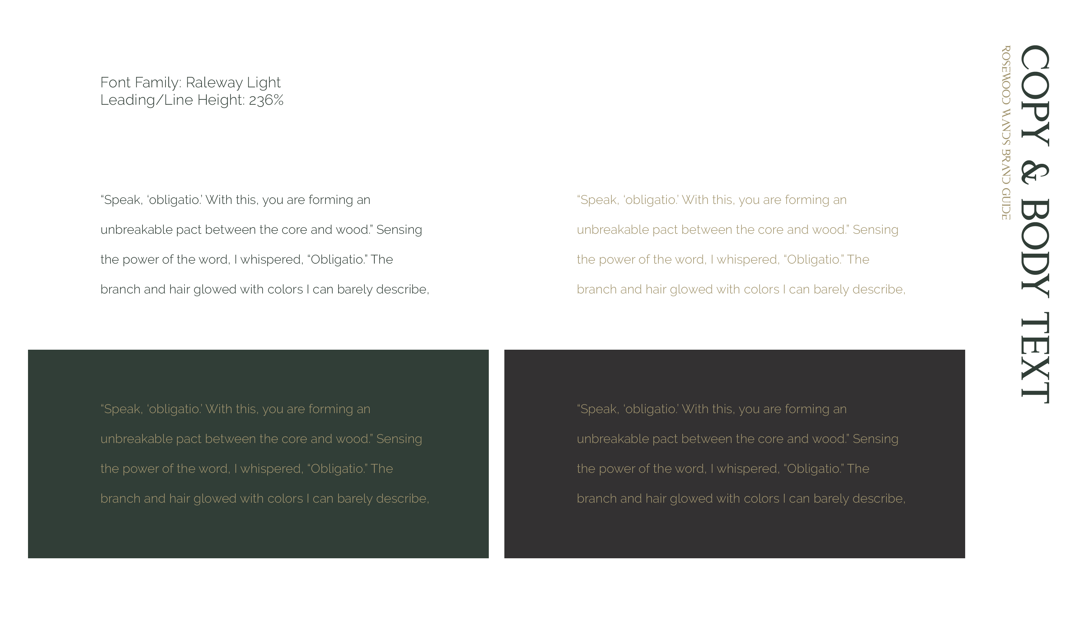
With so much going on, the body text balances it out: modern, clean & minimal sans serif, easy to read & not detract from the rest of the brand.
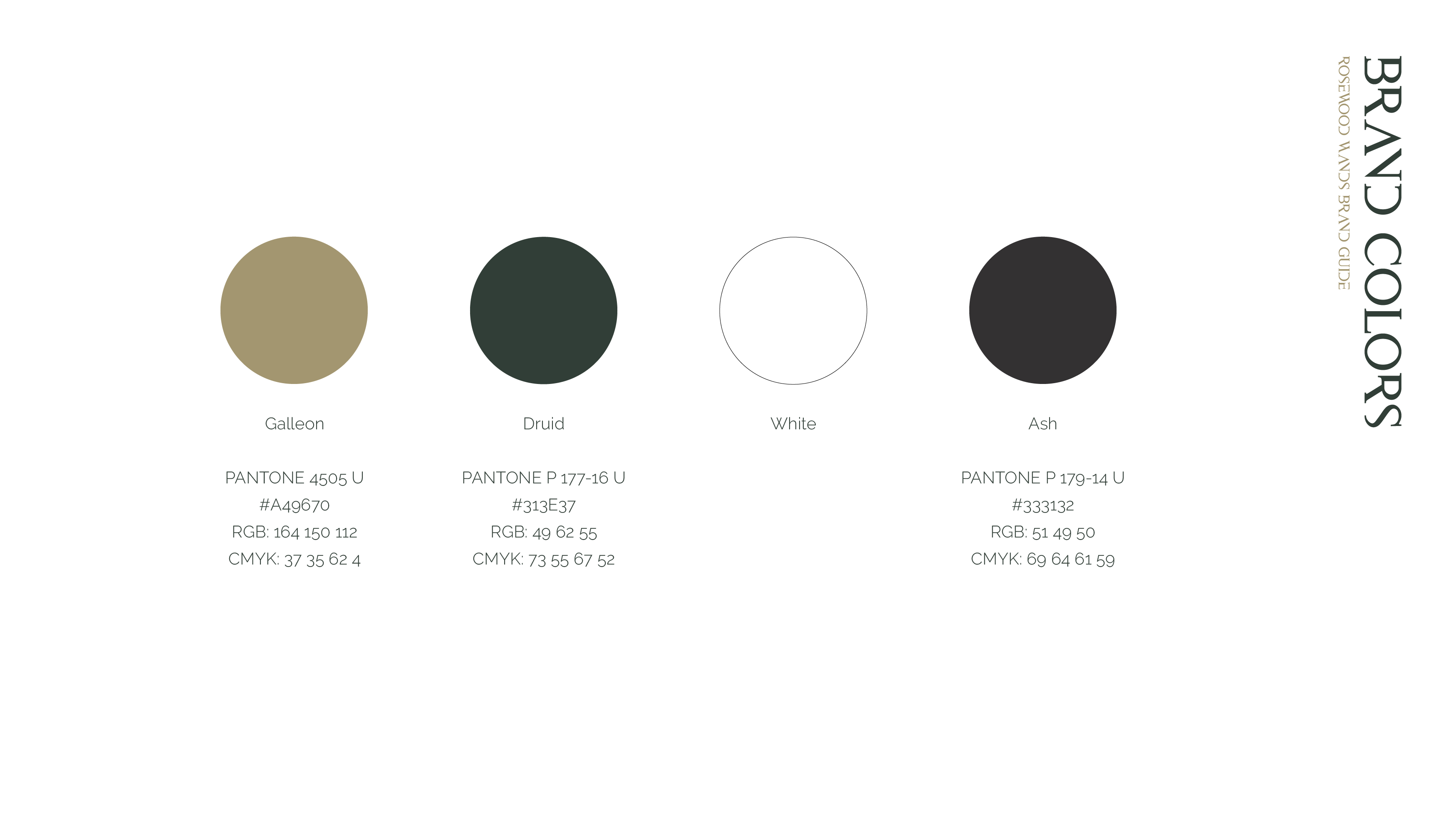
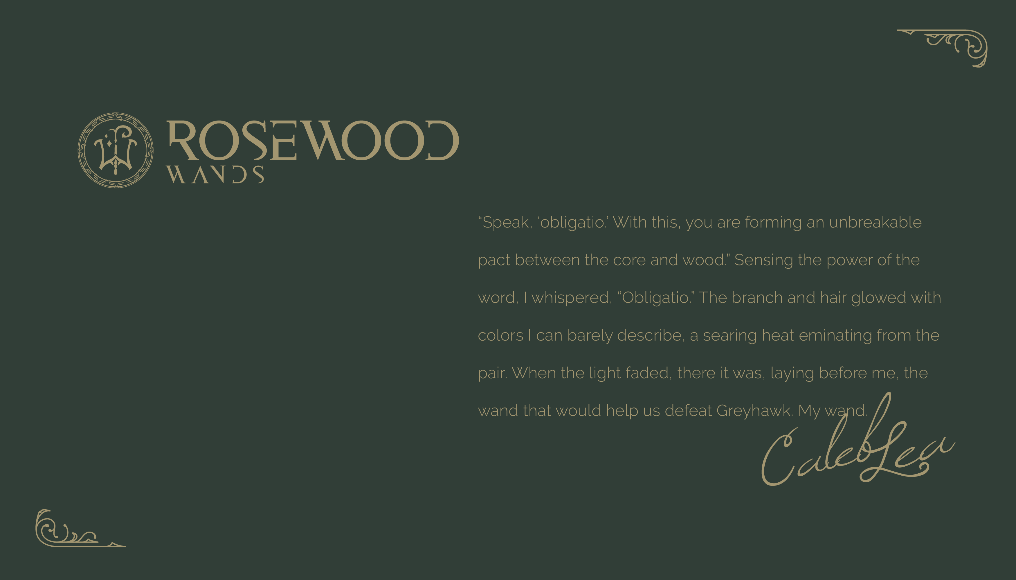
Green was part of the original logo, Caleb's favourite color and symbolic of the natural but is not the easiest colour to work, especially with Pantone matching requirements - it too easily turns garish or muddy. But eventually arriving at the right mix with a gold, magic seemed to unfold.
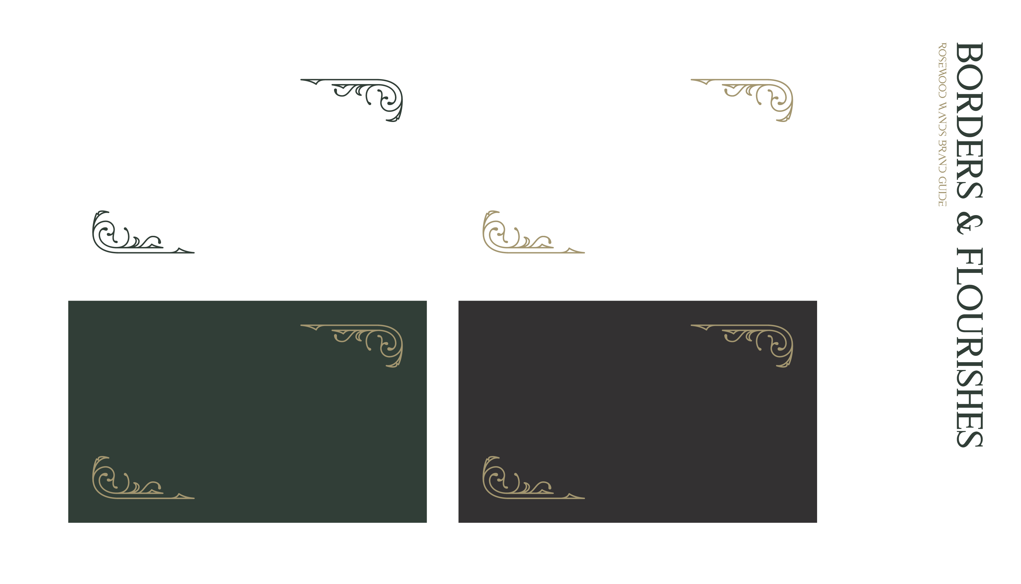
Flourishes aptly frame for layout purposes, and establishes the impression of a magical tome, the story of the wand.
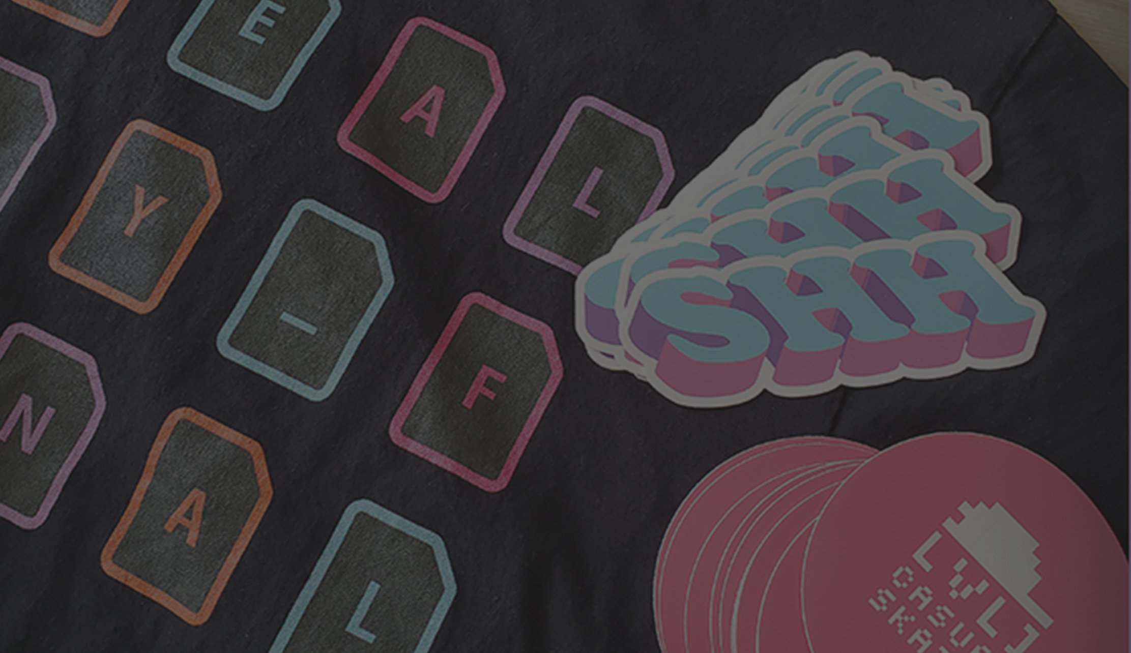
As deliverables, I built out a brand system, brand guide, full logo sets, font packages, flourish assets, coloured backgrounds, social media templates, wand certificate print templates, and more.
All in all, I am very happy with the results, every detail accounted for and all elements working in harmony, as do the wandmaker and wood, as the witch or wizard and wand.