


Branding
/
*Under a NDA, only some details may be provided.
My Role:
Marketing, Branding, UI/UX, Product Design, Project Management
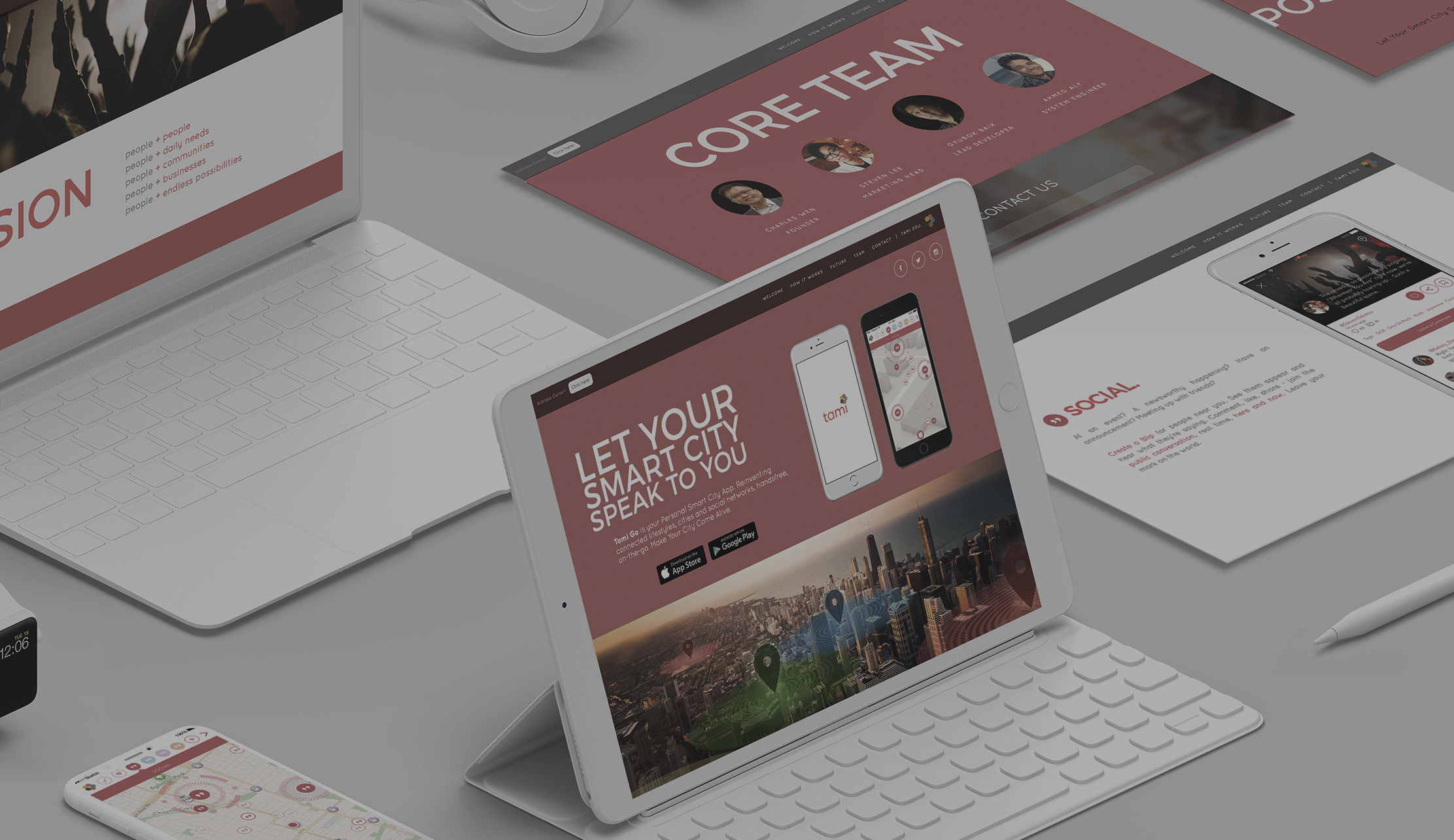
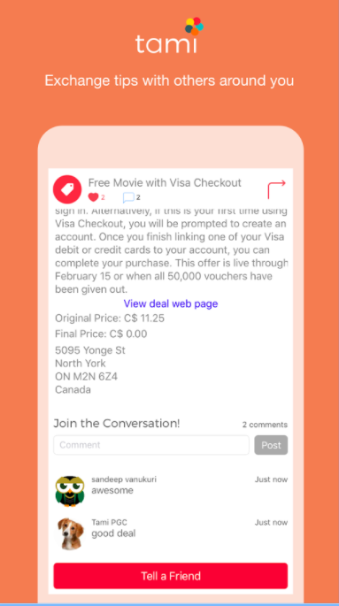
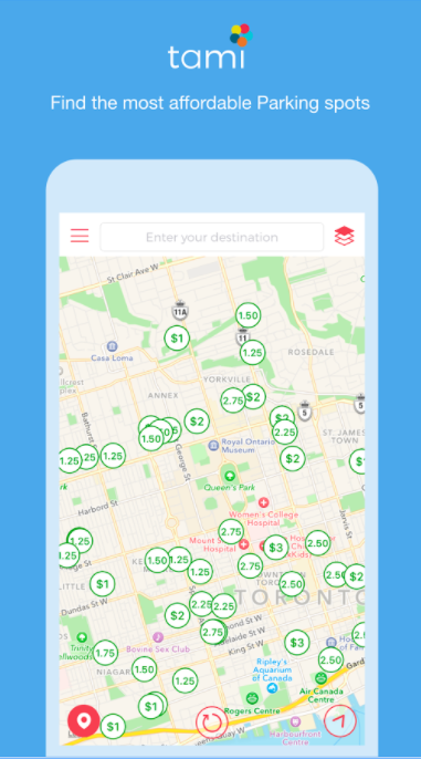
I had the exciting opportunity to work with the award winning Green Owl Mobile tech firm and subsidary start up on their new app product under Tami Smart Cities.
When I was brought on board, I was to give their website and marketing material a make over. Through detailed consultation to understand their vision better, I took initiative to suggest options to improve the product and branding. As a result, I was invited to take lead in the product design and creative direction of the project as a whole.
Original Branding
Original Branding
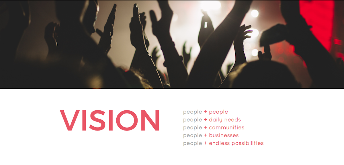
Problems I had to solve included the actual product, but in parallel, the brand evolved as well. There was definitely a need to find a clear identity in all aspects of the project. My process included brainstorming sessions, collaborative discussions, team presentations, mood boards, whiteboard diagrams, sketches, competitive analysis, market research, user surveys, and more. While branding design usually revolves around logos, the logomark was asked to be largely untouched - a wonderful challenge for me.
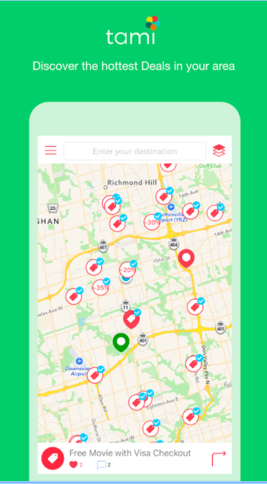
The MVP had begun to be diluted in the additional new features that created scope creep and loss of target user focus. The initial vision of the app was not effectively achieved, conflicting between a variety of technologies and ideas. The product seemed to be competing with major apps like Google Maps, and wanted to allow businesses and service providers to promote on the map, show parking, and social posts, events, and more, with many separate layers and features. My role ultimately was to recreate a streamlined product that condenses and unifies the whole platform and makes sense for the user.
I was able to accomplish this by breaking down the needs and problems of the users and each use case, which included the disconnect between the many niche apps for day-to-day needs, the opacity of our local vicinities, and a lack of customized/personalized content with a contextual immediacy. In other words, I found commons questions were: what's happening in that building and why are there so many people there? Where can I find the nearest bathroom? What promotions and sales are nearby? Who's the closest plumber or electrician? What are some worthwhile destinations to check out in this area according to my preferences? Is there crime nearby?
Users can't see transparently into or learn the neighbourhood around them, wherever they are. Google Maps have ranking hierarchies and don't reveal everything at maximum zoom. Apps like Yelp prioritizes recommendations and reviews. And many apps like Facebook have complex algorithms that are not location first. Nextdoor relies on users' posts. While these issues and technologies have always existed, the gap is not bridged easily and not expanded far enough vertically.
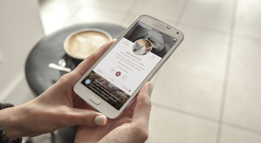
In my consideration of the existing MVP at the time, I was able to simplify the product due to my experience with large social media networks like Facebook and the account and post types that exist simultaneously. I considered the goals and categorized each function into the right data type. For example, business ads, social updates, user posts, location-based or not, and any sort of content were more or less the same: a post first and foremost, while tags, categories, keyword searches and algorithms would allow users to filter their view of the map. Personal assistants are phone interfaces, and therefore, remains an in-app way for users to interact with data and content.
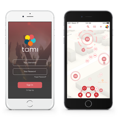
Our processes included brainstorming sessions, discussions, team presentations, mood boards, journey mapping use cases and persona models, information architecture whiteboarding and UML (Unified Modeling Language) diagrams, sketches, user flows and wireframes, style guides and design specs, click-through prototyping, issue logs, feature verification matrixes, competitive analysis, market research, user surveys, and more, I used software like Sketch, Invision, Illustrator, Xcode, and Adobe CC.
Throughout the process, I tested Invision prototypes with focus groups of 5 to 6, every two weeks and ultimately, the final prototype with almost the full complexity and high fidelity of the developed app.
It was also fun to collaborate and learn the workflow preferences of different teams and colleagues. In-house developers I worked with preferred Trello and Slack, while outsourced developers preferred traditional spreadsheets via Google Sheets and emails. The team lead preferred to use software engineering UMLs and requirement documents. I was able to coordinate and bridge the gaps in the process while I was responsible for my own part.
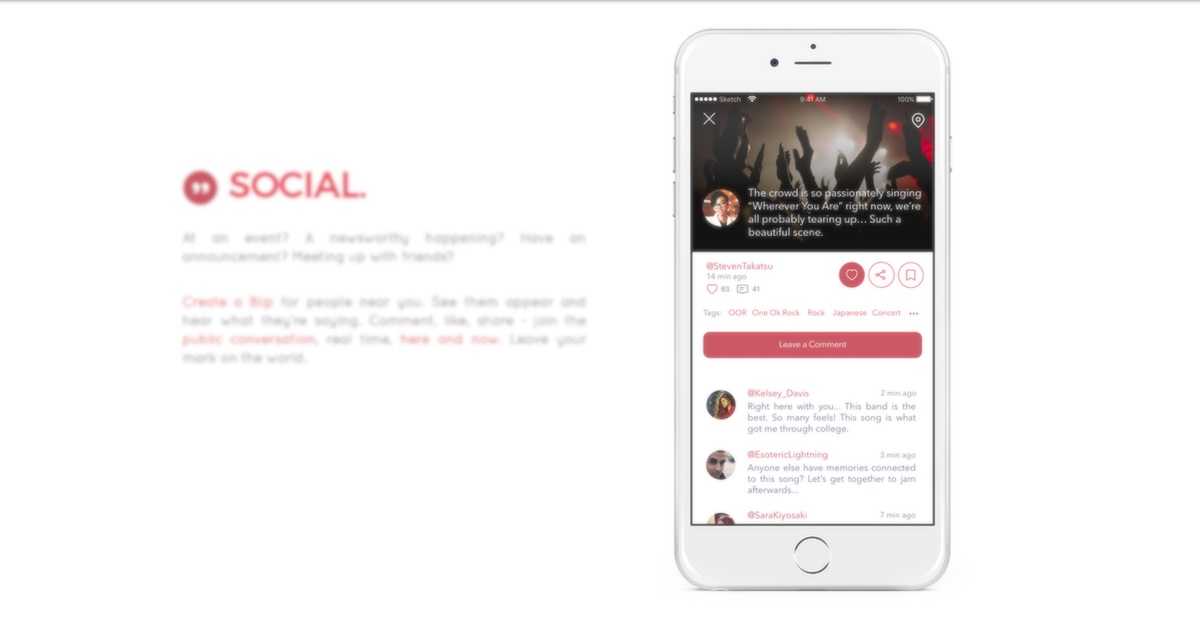
In the end, I invented a new centralized iconic term and concept to represent the app's special form of posts that would serve functionally throughout the app and as a cohesive brand, created over 150 high fidelity screen designs, making sure that every design element can be broken down for code implementation. I designed the architecture and hierarchy of the system, devised a new gamefied economy, and coordinated developers, translating concept to design to code, and pursuing beta testing. I greatly cherished the learning experience and the exploration of my abilities, beyond the role of my initial engagement - I embraced the opportunity to be a Product Lead of sorts.
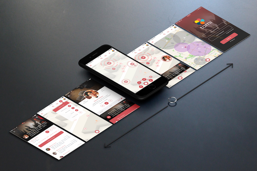
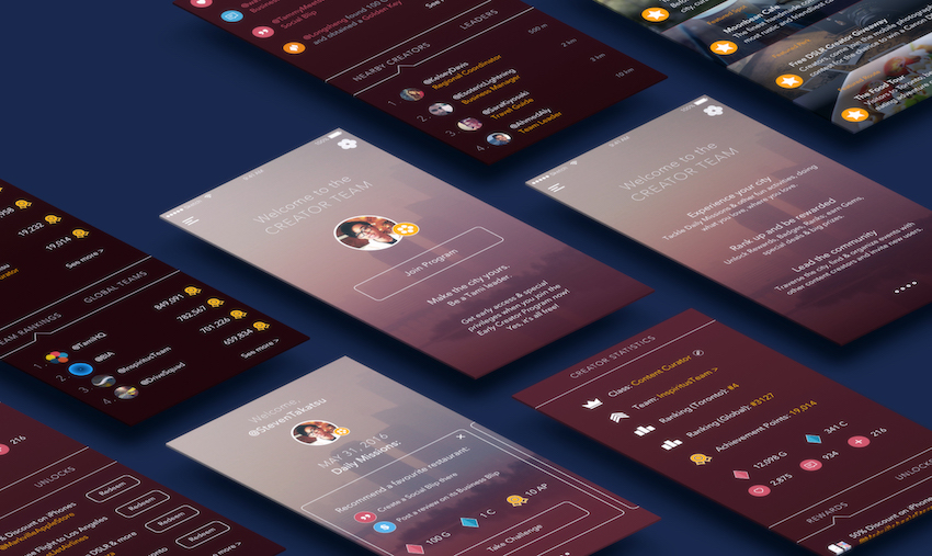
Understanding the characteristics of social networking and personalization, I chose a primary colour scheme revolving around the red already in the logo and in the app's most engaging feature. Red for me represented a new high energy vibe, a bold personality, and dynamic essentiality to the day-to-day of city life. Red is also known to be a colour that increases passion, appetite, heart rate, sense of urgency, impulse, perfectly capturing the app's here-and-now and user-to-user vision.
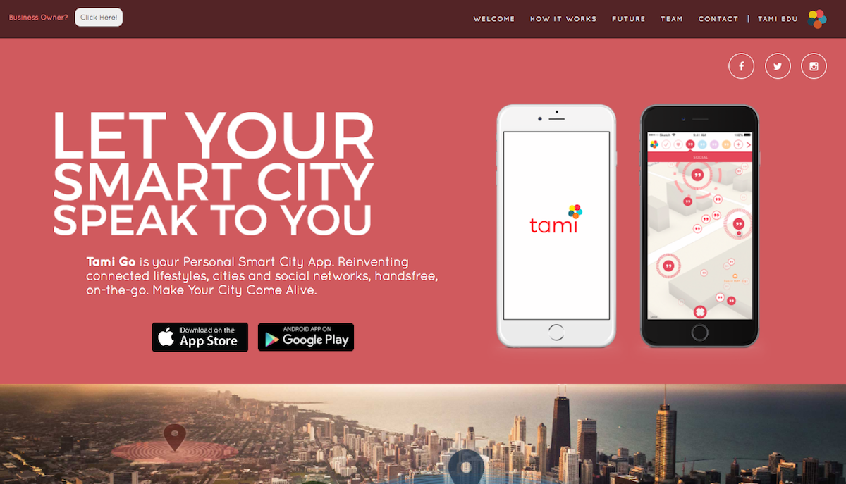
For the product to work and help support small businesses in the city, I proposed that we needed a sizable consumer community to begin with (I won the chicken and the egg discussion). The target audience would be of demographics 20-40 years of age, social media saavy, with an agency to travel, spend and virally instantly share their experiences, entirely what the app was about. Red supplemented with large sans-serif capitals (Montserrat was the typographical choice for headers as per their initial branding, and Quicksand for a casual youthful approachable body text) and assymetrical design best produced reactions in our A/B testing rounds. (On the contrary, I chose deep, calming, mature blues for their second project, an education app that was catered to parents and teachers in the hustle and bustle.)
While its original designs were multicoloured and low in contrast, I preferred to ground the product with monochromatic schemes and darker colour values, giving it pop, moving away from a generic corporate look, to a more intimate and personal experience.
I further developed marketing copy, catchphrases, and slogans, reinterpreting and humanizing many technical terms provided by the rest of the team, through many iterations and editions.
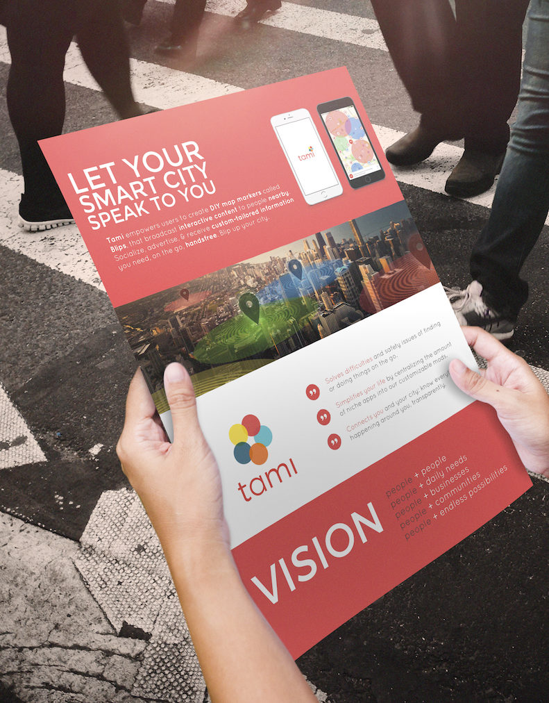
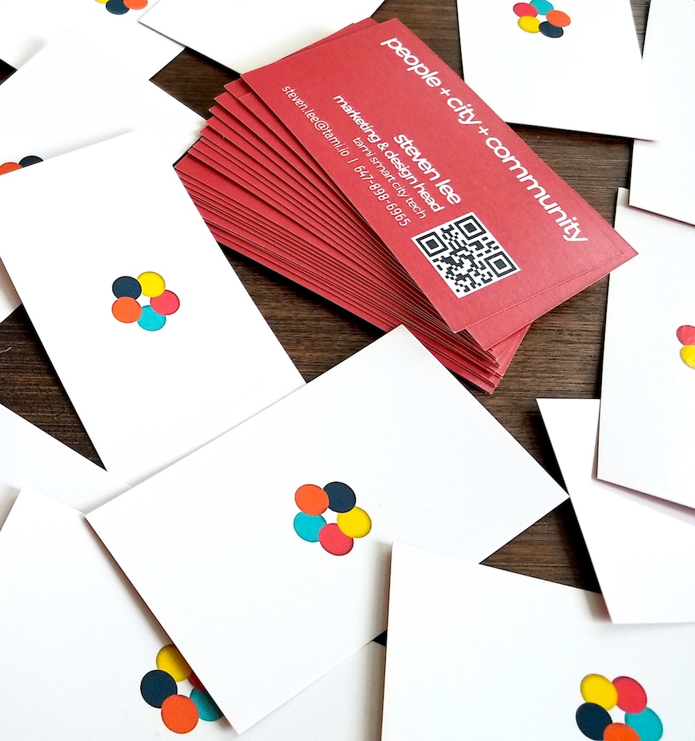
My branding work with Tami consisted of business cards, powerpoint presentations, website redesigns, one pager flyers, app store promotion screens, typography and colour guidelines, t-shirt concepts, event booth proposals, and other knick knacks.